The Great Bloomberg Reshuffle: Land Use, Power, and Unintended Consequences
Research, GIS Analysis
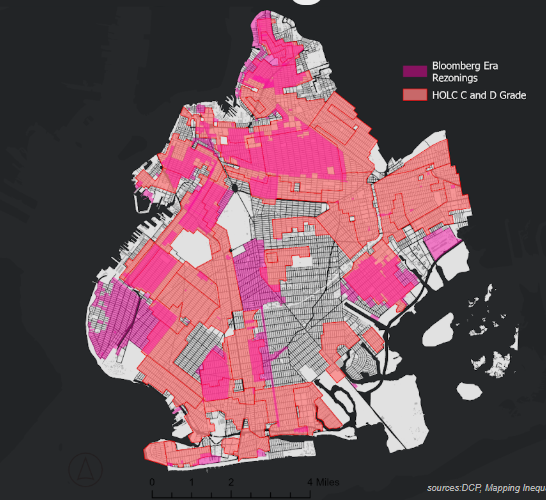
Context: Redlining and Rezonings
Between 2001 and 2013, the Bloomberg administration enacted 120 rezonings, impacting roughly 40 percent of New York City’s land area. Yet despite this sweeping intervention, these rezonings increased residential capacity by just 1.7 percent, raising critical questions not only about affordable housing, but also about land use efficiency and equity. I conducted a GIS analysis of these rezonings and layered them with demographic data to examine how the legacy of redlining was perpetuated through land use decisions. My analysis visualized patterns of gentrification, using indicators of rent burden, wealth disparity, and displacement as ways to illustrate gentrification. The goal was to make complex zoning policy legible and relevant to the communities most affected, and to support more inclusive conversations around how we shape our city through rezonings in the future.
Also worth interrogating is how these rezonings uphold the ugly legacy of redlining, as shown here with the mapping if the Home Owners’ Loan Corporation designations of C and D grades, which are more colloquially known as redlined areas.
Methodology and Process
DEMOGRAPHICS // CHOROPLETH MAPS
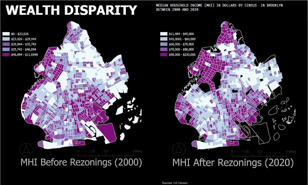
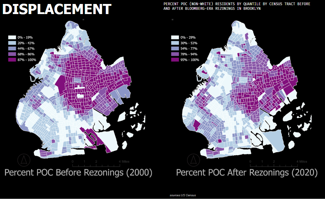
Using 2000 and 2020 census data to explore MHI, percent POC residents (non-white), and rent burden, this research mapped demographics before and after the selected rezonings. 2000 and 2020 were chosen to give a wide enough range to illustrate change over time and to show thew before/after of the
MHI was identified by dollar amount and did not account for inflation, future research should account for inflation and normalize this data
Percent POC was calculated as all non-white residents and normalized as a percentage rather than a number
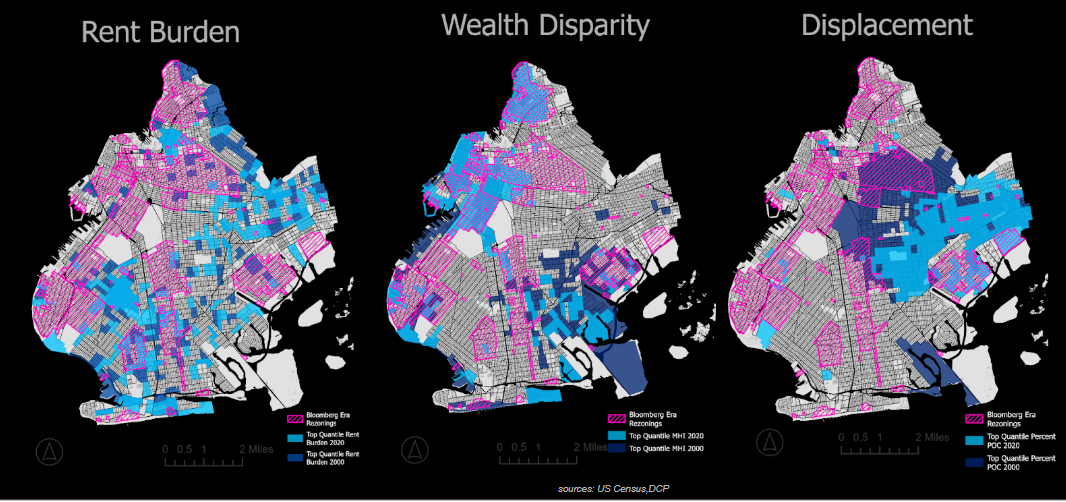
Rent Burden was identities as Gross Rent as a Percentage of Income (GRAPI) of more than 30% rather than just 50%
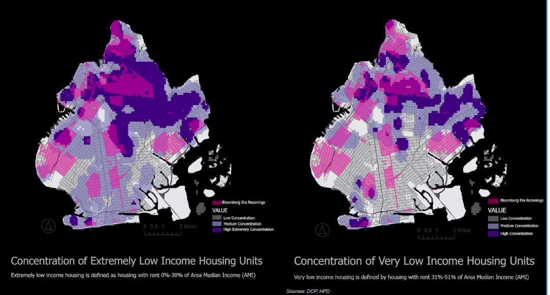
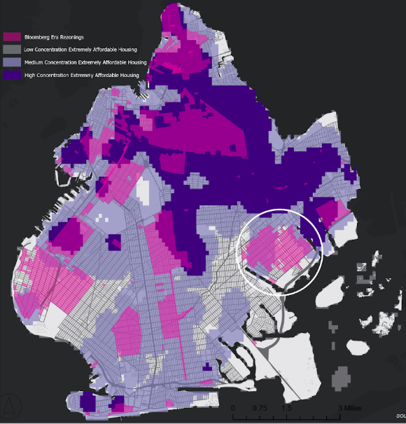
AFFORDABLE HOUSING UNITS //KERNAL HOT SPOT ANALYSIS
Using a kernal hot spot analysis I identified affordable housing units in concentrations of low, medium, and high concentration and mapped only ‘extremely low income’ and ‘very low income’ units.
TIME FRAME
The study employs census data from 2000 and 2020 to analyze changes before and after the Bloomberg administration (2002-2013) in order to provide ample time for effects to be clear.
FUTURE // RASTER ANALYSIS, SITE ANALYSIS, AMI & DEFINITION OF AFFORDABILITY
Future research should calculate the percent change over time while also noting that the census tract boundaries changed within the time frame studied.
Future research should consider utilizing raster analysis to create scores for all rezonings
In addition to scores for affordable housing, future analysis should include where ‘affordable’ housing is being built regarding threats like flood, heat, and air quality as well as proximity to amenities like schools, parks, and transit
Where is the ‘Affordable’ Housing?
“Affordable housing is based on a household's percentage of Area Median Income (AMI), which is set by the federal government on a yearly basis. Housing is considered affordable if it costs about one-third or less of household income, and is regulated so the rent can't go up dramatically over time.(Internicola, S., & Block, L., 2022) ”
It is also worth noting that studies show that AMI numbers are grossly inflated because HUD calculates AMI for the NYC region as a whole (including Rockland, Putnam, and Westchester county), and because of the ‘HHCA’ (high housing cost adjustment) where in *high-rent metro areas, AMI is actually not based on incomes at all. It instead reflects the area’s sky-high rental costs (Internicola, S., & Block, L., 2022).
*The logic behind the HHCA is that in areas with disproportionately high rental costs, more people will need affordable housing. By raising the incomes that correspond to each AMI level, HHCA makes more people, with higher incomes, qualify for affordable housing. The steps taken to calculate the high housing cost adjustment, outlined below, come from HUD’s Income Limits documentation for the New York, NY HUD Metro Fair Market Rent Area in 2022.
In NYC in 2023 AMI was identified as $127,000 for a three-person household.
Extremely low income is defined as 0%-30% (as of 2023 0 - $41,940 for three person household.
Very low income is defined as 31%-50% (as of 2023 $41,941 - $69,900 for a three-person household) (HPD).
How Did This Change Things
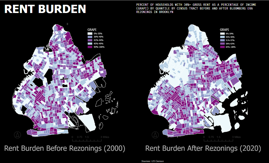
Rent Burden
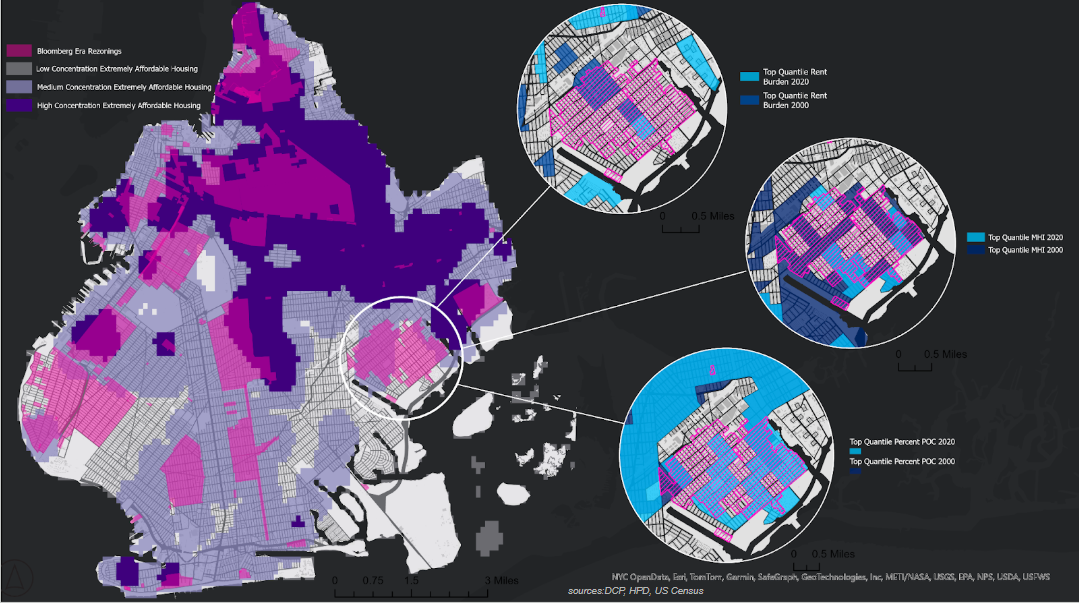
Where are residents the most rent burdened before after rezonings?
Wealth Disparity
What is the Median Household Income in areas before and after rezonings?
Displacement
Where are non-white residents before and after rezonings?
The Consequences of Rezoning
Top quantile of rent burden, median household income (MHI), and percent of non-white residents before (2000) and after (2020) Bloomberg Era Rezonings in Brooklyn
Upzonings and Downzonings
“The Furman Center also looked at what types of neighborhoods were upzoned and downzoned. Upzoned lots tended to be in areas that were less white and less wealthy, with fewer homeowners. Downzoned lots tended to be areas that were more white and had both higher incomes and higher rates of homeownership than upzoned areas. Areas with contextual rezoning were even whiter and richer (with median incomes “much higher than that of the city”), and had “very high rates of homeownership. In other words, more privileged people were more likely to have the city change the zoning of their neighborhoods to preserve them exactly as they were” (Laskow, 2014).
Zooming In: A Case Study on Canarsie
The 2009 Canarsie Rezoning is a quintessential Bloomberg era rezoning in that it was primarily a downzoning effort.
“... most of the Bloomberg-era changes were…little-noticed, and more about determining what won’t be built than what will” (Politico).
THE CANARSIE REZONING DID WHAT IT WAS INTENDED TO DO: MAINTAIN THE STATUS QUO OF THE NEIGHBORHOOD. IT DID NOT RESULT IN A SIGNIFICANT AMOUNT OF DEEPLY AFFORDABLE HOUSING.